The Second Shelf
A few weeks ago, author Meg Wolitzer wrote a wonderful essay in the New York Times Book Review titled “The Second Shelf: Are there different rules for men and women in the world of literary fiction?” ... YES.
She begins with this thought about the much fawned upon "The Marriage Plot":
If “The Marriage Plot,” by Jeffrey Eugenides, had been written by a woman yet still had the same title and wedding ring on its cover, would it have received a great deal of serious literary attention? Or would this novel (which I loved) have been relegated to “Women’s Fiction,” that close-quartered lower shelf where books emphasizing relationships and the interior lives of women are often relegated?

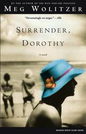
She makes a great range of interesting points, but my favorite parts were all about this 'feminization' of female authors' book covers compared to those (that touch on the same subjects) of men.
Look at some of the jackets of novels by women. Laundry hanging on a line. A little girl in a field of wildflowers. A pair of shoes on a beach. An empty swing on the porch of an old yellow house. [Can't you picture all of these?! Have you not walked by them in the airport bookstore a million times before?]
Compare these with the typeface-only jacket of Chad Harbach’s novel, “The Art of Fielding,” or the jumbo lettering on “The Corrections.” Such covers, according to a book publicist I spoke to, tell the readers, “This book is an event.”
Of course there are always exceptions to the rule, but being both a bit of a font freak and someone who gags at covers with soft focus photos of young girls in white dresses in green fields, I found her point interesting. And she just CRACKED me up with this:
Certain images, whether they summon a kind of Walker Evans poverty nostalgia or offer a glimpse into quilted domesticity, are geared toward women as strongly as an ad for “calcium plus D.” These covers might as well have a hex sign slapped on them, along with the words: “Stay away, men! Go read Cormac McCarthy instead!”
Naturally I had to look up what all of her book covers looked like. Her first book seemed to fall into the category of "calcium plus D" (on the left), but for her most recent (and there are several in between) she seems to have found an ungendered balance that is totally intriguing to me:
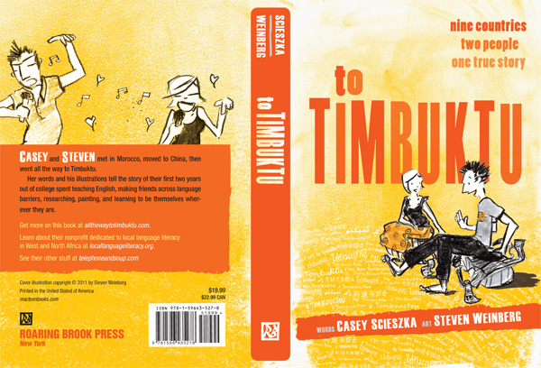
All this cover talk is making me remember how when Steven and I were working on the cover for our book, To Timbuktu, one of our biggest fears was accidentally scaring off male readers with our cover choice and/or subtitle.
For example, one of the initial subtitles floating around was "A Love Story", which yes it is (awwww!), but we realized that saying it explicitly might have the same effect on teenage boys as slapping a giant tampon on it. We even wound up avoiding positioning ourselves in any way that looked like we were being too affectionate (ie holding hands).
Ultimately we're really pleased with what we worked out with the Art Department and just LOVE that we managed to sneak some hearts in there. On the back cover of course...
So the moral of my Thursday is, everybody judges books by their covers.


