I Love Lamp: Rustic Paris
Exposed beams and endless croissants? Rustic Paris, count me IN.


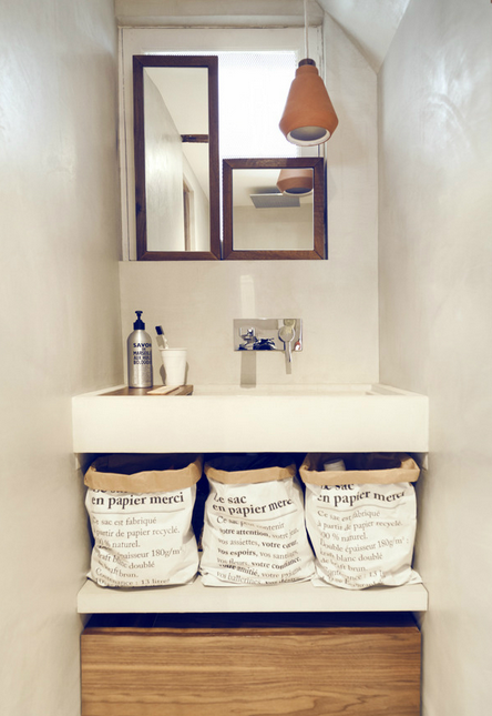

Photos via Style Files.
(What is I Love Lamp? This is I Love Lamp.)
Exposed beams and endless croissants? Rustic Paris, count me IN.


Photos via Style Files.
(What is I Love Lamp? This is I Love Lamp.)
So remember how last time I had to stop wallpapering the hallway because I ran out of Encyclopedia pages? Well I got myself another one, Sarsaparilla to Sorcery! And after tossing aside a few unpleasant entries (think: Slavery) I was sure I'd have more than enough pages to finish the remaining one and half walls. And I was totally right!
BUT THEN I RAN OUT OF GLUE.
(What is I Love Lamp? This is I Love Lamp.)
Can't stop won't stop with the painting over here! This week: the guest room. We've had to do some odd things to that room, like add a chimney for our wood stove downstairs and shorten a window so that one day we could replace the old fashioned porch that was once on the front of the house. So we've been living with some rather unsightly spackling and such for a bit:
And while these photos don't really display it, the grey was showing some pretty serious wear and tear, as happens with paint over time.
I took everything but the bed out of the room and removed the doors, which turned the hallway into a bit of a nightmare.
(It's felt like a weird game of musical chairs over here-- just constantly moving the chaos from room to room as I redo each one.)
Then I got to work painting the trim a glossy white and the ceilings and walls flat white. The process was in all honestly pretty boring, but what can ya do?
Once that was done, I was faced with dragging those ancient white bookshelves back into this pristine new room and that just didn't seem right. But where would the books go?
"On barn shelves of course!" was basically Steven's answer. But instead of using the barn wood planks (of which we don't have too many left), we decided to simply rip out the actual shelves in the barn we'd been using for tools since our longterm plan for that space is demo the heck out of the interior anyway.
(That's them in the upper left corner, shot during the summer obviously. Oh, summer.)
We opted for four and went bottom to top, lining up the bottom shelf with the height of the bed and the bathroom door. Waldo, as usual, was incredibly helpful hung around the entire time trying to eat sandpaper and whatnot.
And ta-da!
Next up for this room is getting a door, but for now I like that you can see the encyclopedia wallpaper from the bed. Not mention, any guest who comes over and needs privacy is staying in the inn anyway, haha!
As usual, let's conclude with a little side by side Before and After because they're so satisfying! Like the static version of a montage. Facing north:
And facing south:
Also, because I might be certifiably insane, I decided to repaint Steven's studio shelves right after this which I'd given a first attempt back in September. And I mean right after-- like the paint brush did not even have time to dry.
I have yet to take some good After shots, but here's a During for your enjoyment:
Steven posted this midway through to Instagram and the audience was divided as to whether or not to continue...
I'll save the After for next time...!
(What is I Love Lamp? This is I Love Lamp.)
Guys, we have been some busy DIY country mice out here! Right after updating our bedroom, we decided it was time to tackle the upstairs hallway. We'd been putting it off because we were a little stumped about how exactly to proceed. As you can see, when we bought the place, that hallway was in a transitional state-- partially wallpapered, partially trimmed:
Back in October I painted the linen closet and did a paint test on the hallway walls juuuust in case a coat or three of white could do the trick, but with all the strange layers and textures going on it looked like crap, so there went that idea:
After a few months of thinking while working on other things, we decided the most sensible, inexpensive, and we-can-do-it solution was to:
1. Mimic the existing trim with some new lumber to complete the doorways lacking it.
2. Paint all the trim a uniform, glossy white.
2. Use the pages from an old encyclopedia as "wallpaper".
Trim went up first. Steven turned his studio back into a wood shop and cut down the trim pieces we'd ordered from the local lumber spot to size.
Then nailed them in place with finishing nails:
Hammered the nails in in deeper with a nail set:
Then filled the holes with puddy:
The top part of the trim around our house has a small shim detail that we included to match. Not particularly difficult to do but looks all that much nicer:
The trickiest doorway was the one at the end of the hallway where there were some gaping holes and crazy warped walls. After measuring at key points up the frame, Steven just went for it and hand milled the trim to best match the wobble with a circular saw.
SERIOUSLY IMPRESSIVE STUFF FOR A NOVICE CARPENTER GUYS.
When we put 'em up we saw there were a few dark spots created by the shadows of the teeny gaps so we nailed some scrap wood in behind the trim to best cover it and I gave it all a quick coat of white paint.
Meanwhile, I was having a go at the 1947 Encyclopedia Britannica that I'd ordered from eBay for eleven bucks. With an exacto knife, I carefully cut out all 700 plus pages (which yes, were so thin I could do many at a time).

Vase to Zygote contains lots of crazy and fun sounding terms and places and what not. It also contains several topics I didn't want to plaster on my walls and walk by everyday. From all of World War I and II to these:
Still, even though that eliminated a fair chunk of the book from use, I figured I'd have plenty to work with. I mean, it's a goddamn encyclopedia.
As Steven put the baseboard trim up, I taped up some of the pages that didn't make the cut to see if I wanted to paste them in an orderly grid or layer them.
Because I kind of value my sanity, I opted for the more organic look if you will: the layers. But before I could go about pasting those up with wallpaper glue, I had to prime and paint all the new trim Steven had just finished, as well as prime over the inconsistent coloring of the walls. And oh yes, I'd have to paint the ceiling too because we wouldn't want to have to do that later and drip all over the new wallpaper.
Just a few things.
At least I love the process of white paint going up. It feels so CLEAN (even if you're just glopping over spider webs).
Somewhere in the middle of all this Steven went out of town to visit his college buddies for a night, I listened to "Shake It Off" approximately 9,000 times, and in the middle of scolding a barking a dog I stepped off my chair DIRECTLY INTO a bucket of paint.
Oh my god, it was like a bad cartoon-- the barking, and the paint splattering everywhere, all while I hysterically laughed at myself. Here's the calm right after the storm:
Still having fun though:
Next up was a wallpaper test patch to see if I needed to be careful about keeping the glue off the front of the pages, and to see if when I layered them you could see through them in an unpleasing matter etc.
In the end it was clear I could go pretty nuts with the glue brush which was great because while the hallway doesn't seem that big, this was clearly gonna take a fair deal of time. Which by the way is something you NEVER calculate accurately when entering a DIY project. Because otherwise you'd never do it.
Up went the pages, day after day, with breaks in between naturally. I do have an inn to run after all! And finally, FINALLY, I finished last night.
Well, "finished" meaning I ran out of encyclopedia pages about 3/4s of the way. But I chose a purposeful ending point so as I wait for my next encyclopedia to be delivered I won't feel like I'm walking through a construction zone. BUT LOOK!
Sorry for the strange lighting-- this hallway is surprisingly hard to photograph. But you get the idea. Pages upon pages of weird information carefully layered as wallpaper, successfully covering the odd textures and colors of the wall underneath. Tada!
I went the extra mile and used a paper cutter to cut the pages that touch the ceiling and trim so that the random stacking would exist all the way up and down the wall. It's as if the pages are emerging from the ceiling and baseboards and that the doors were cut out after the fact. Time consuming but worth it.

In the process I learned quite a bit about Welsh Literature, X-Ray Crystals, and Zoology. And I plan to learn much more, each time I pass through the hallway!
I realize that until we redo the bathroom downstairs, everyone who comes over and needs to use the restroom will take awkwardly long and return full of facts about Western Australia and George Washington. But I'm totally cool with that.
So while I still have a bit more to do I can see the light at the end of that particular tunnel. And in the mean time I'm having fun sprucing up other details in the house. Like this birch stairwell handrail we installed:
Just a fallen birch snag from around here and basic stainless steel handrail hardware.
And this built-in nook in our living room I decided to paint the night before we left for a quick trip to Montreal with our buddies who run Brushland Eating House.
Again, like the hallway, kind of hard to photograph but trust me, it feels luxurious.
We were totally inspired to do that by those same friends, Sarah and Soheil, who run a delicious and beautiful spot wonderfully slathered in good glossy black paint.
(This photo by Escape Brooklyn.)
So yeah. We're still going strong over here on the home renovation front!
To wrap it up, here's a few side by side Before/After shots because those are always oh so satisfying!
(What is I Love Lamp? This is I Love Lamp.)
I love, love, LOVE the barn wood bar that Steven built for the Inn. It's handsome and sturdy and very much suits the surroundings.

I'm just realizing that I never actually made a post on how he built it. Hmm.... Here's the quick photo montage:
And DONE! Haha! Well actually it nearly happened that fast. Design*Sponge confirmed that they were gonna come up and do a feature and we were like, "Cool, there's literally nothing in the rooms right now but that's fine. We'll TOTALLY be able to stage two room types and build a bar in three days".
And while it was kind of insane, we did it.
We kept a lot of the bar the same for the first few months, moving and/or adding things here or there depending on how we'd seen guests use the space.
But as time has gone on, I've found myself feeling not entirely in love with this corner:
The orange chairs and low white stools are in the rooms and I love them there--
But for whatever reason they just weren't doing it for me in the bar. They somehow felt a little... dainty all together.
So one afternoon sitting behind the bar I asked myself, "If you could have anything there, what would it be?" and immediately I was like, "Duh, a big barn wood booth."
So I asked my carpenter-man and he said, "No problem" and spent the next few weeks thinking and planning, solving questions of weight and support and how to do this with as little lumber as possible. I'd wake up to the alarm ringing and roll over to find him open eyed, already talking. "I think I figured out a way we can get the kick space to yada yada carpenter talk early in the morning..."
We've been on a crazy project binge recently, finishing the wood trim in the hallway and "wallpapering" it with old encyclopedia pages and--
I'll do another post on that once it's finished up, but there's a sneak peek for ya.
So basically we've be on such a roll that we figured fuck it, let's keep going! Yesterday (yes, on Christmas Day, after opening presents), Steven turned his studio into a woodshop and built the booth's skeleton out of new lumber:
And luckily today it was sunny for the first time in weeks and all the snow had melted and our guests weren't arriving til the late afternoon so...
We dragged the interior frames into the bar and set up camp in there. And by "we" I mean "he". I mostly ran around with the dog, did some springtime-esque yard work, and wheelbarrowed over lots of wood for our bar's fire pit.
I occasionally bopped in to hold pieces in place, press here, pass me that etc. And to take pictures of course! Of Steven drilling from the underside so you won't be able to see screw heads on the bench seat:
Of the fronts with kick-spaces going on:
Of myself at the bar:
Of Steven head butting his shadow's butt back supports going up:
Of two stacks of planks for the backs of the booth:
And of the finished product!
If the carpenter looks a little more dazed than pleased as hell with his work, that's because he's consumed only half a Cliff bar and a Coke all day. And it's 4:15pm. And he just dragged that stump in to be a temporary table.
But YAY! Isn't he good?! Doesn't it suit the bar so well?!
Here's Before and After right next to each other:
Next up making a low table to set drinks on. And re-hanging the art and maps so they suit the new set up. And finding a new place for the toaster oven in the mornings. And making a pillow or five so guests can get cozy with their Nordic glögg and boyfriend and whatnot.
Woohoo! Thank you Steven! I love it. I love, love, LOVE it.
UPDATE 12/28:
He used the bases of those Ikea stools and made custom wood tops. BAM!
And I moved some pillows and dried wildflowers in here to soften it up. Ba-BAM!
But I didn't use a real camera to photograph it. BAM! I mean, sorry.
(What is I Love Lamp? This is I Love Lamp.)
As I attack the rest of the house with white paint, I'm dreaming of a country kitchen...

We've done a very surface level touch up of ours. We began like this:
I painted just about everything white, we put up some barn wood shelving and some hanging baskets (eff you mice!), hung a barn door...
And when we were having the outside of the house done we installed new windows and doors which has been great for the keep-the-heat-in game. But we've kinda plateaued on the rest of the progress front. And on the functional front. Because the next steps are BIG. Like, rip out the ancient linoleum floor big. And the walls. And the possibly sagging ceiling? And OH MY GOD THIS CORNER:
It being a kitchen and all there's a lot of moving parts and complicated elements between all the plumbing and electric and gas and and AND... You have an idea to take out one thing and then you're like, "Oh wait, that's physically attached to this other thing and if we rip that out then--" blah blah blah. And we're reaching our skill limit. I'm good with a paint brush, but I'm not exactly trying to trim out every window over new dry wall I installed, you know?
So in the mean time, like I first said, I'm doing all kinds of planning and scheming for that country kitchen...
(Top photo I've seen EVERYWHERE but cannot find an original credit, second photo is via Mother Mag, third photo is Jersey Ice Cream Co-- of a house that's only about 15 minutes away... think I can just move the whole thing to our house??)
(What is I Love Lamp? This is I Love Lamp.)
There are a handful of large-scale things we still wanna do to the house, like re-install 2 bathrooms that were demo'd by the previous owners and renovate the kitchen. But before undertaking things of that scale we figured we should take care of all the other smaller projects that we can do ourselves inexpensively. I was so pleased with my office make-over, why not approach the rest of the house the same way?
(By the way, we hung that plant. BOOYAH!)
So Wednesday morning I went to the local hardware store, stocked up some pure white paint, and got to work on the master bedroom.
Here's what it looked like before: (with Waldo showing off for the camera)
Fine. Just a little grey, not entirely pulled together. It didn't really reflect our style since just about every piece (minus the poncho pillows) we'd picked up for free somewhere along the way. Not a bad deal at all! Just not so purposeful.
I did a test corner first to make sure that the cream colored trim wouldn't look dirty next to the fresh coat of white which can sometimes happen--
It looked fine so I proceeded with the rest of the room.
I got about a third of the way through before I had to stop so we could go to the tree lighting down the road at the Community Hall. I felt like such a country housewife covered in paint, rushing around to get a pasta dish together for the pot luck. Though my part in the production was rather minuscule compared to Steven's:
Yup. The town Jew was Santa Claus. And oh my god it was so freakin adorable!
That night we slept in the guest room because otherwise we'd get all paint-high. It was cozy. And I was happy to give it a test-run finally.
Especially because I wanted to see if moving the bookshelves out of the master bedroom there made it feel too crammed.
Totally fine!
Thursday morning I got the roller back out and finished the paint job while Steven and I listened to the new Serial podcast that everyone's been talking about. That made the rest of the job fly by!
At this point I enlisted Steven to help me make and hang two new floating bedside tables to be made out of-- you guessed it-- barn wood!
We used a 10" wide piece and tested it with the objects we'd actually keep on it, and settled on 20" long. Two quick cuts, a few screws drilled into some L brackets left over from hotel renovations and BAM! Bye-bye dust bunny hide-out.
And the room feels huuuuuge now that we don't have the bookshelves in it! We'll probably get some kind of a chair or hamper eventually, and perhaps hang some art again but for now we're both enjoying the serene simplicity of the space.
As you can see though, we decided to hang my fern in there for a pop of green. Steven's caught the hanging plant bug too!
And now I must resist the urge to go nap in this lovely little haven...
One more time, before and after:
(What is I Love Lamp? This is I Love Lamp.)
For the past few weeks I've been obsessing about getting indoor plants. Probably because everything but the pine trees outside are dyyyyyyyying right now (of the normal "oh it's winter now" kind of affair).

It should be noted that my indoor plant track record is spotty at best. I mean, I've killed cacti before. Yes plural.
But I'll change! I swear! To have something beautiful and green hanging in my home office. Because hanging is the other very important part of this indoor plant obsession.

After a little online research (ok fine, after at least two hours of cruising Tumblr, Pinterest, and all kinds of previously unknown to me plant sites) I settled on: the philodendron.
At the suggestion of my florist/landscape designer friend extraordinaire Molly, I checked out what our local grocery store's nursery had during yesterday's trip to town and low and behold there they were!
I came home with this guy:
Which I obviously have yet to hang, but already I LOVE IT!
And because it was one of those days, or maybe I'm just that kind of shopper, I also came away with something else:
A lovely little fern! Which had been the other plant type high on my list. Because for fifteen more dollars, why not have both?
Now if somebody could check up on me in a week or so make sure that I've actually hung up these guys that would be great. Because I'll admit right now: I never finished that poncho pillow.
(What is I Love Lamp? This is I Love Lamp.)
Our upstairs hallway is getting a bit of love. Here's what it looked like Tuesday afternoon before I decided I absolutely needed to fix it that very instant.


Which I totally did in just one day!
Or not.
I know I keep posting "Before" photos and no "After" ones, but that's because we're kinda "Somewhere In Between" on just about every house project at the moment. Which by the way is driving us a little NUTS. I nearly screamed into a pillow Tuesday afternoon when I was trying to open the bathroom window so I wouldn't die from wallpaper remover and paint fumes and for life of me could not do it because it had been painted shut from the outside.
I called my mom and felt better, then Steven used his super strength and opened it for me. Aka, support systems are very much necessary when renovating an old house.
It's so tempting to just want to be DONE with all the work. But what is "done" anyway?
Ok fine, fine, I'll take "very nearly finished", how's that??
(What is I Love Lamp? This is I Love Lamp.)
I came across the Tumblr Baobab Interiors and it was almost too much.
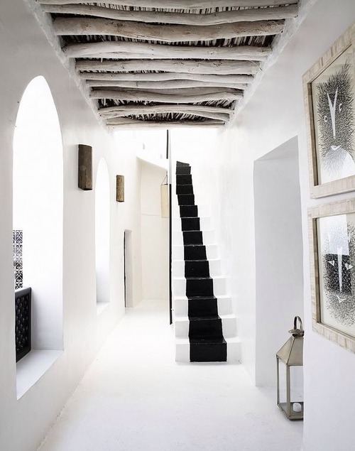
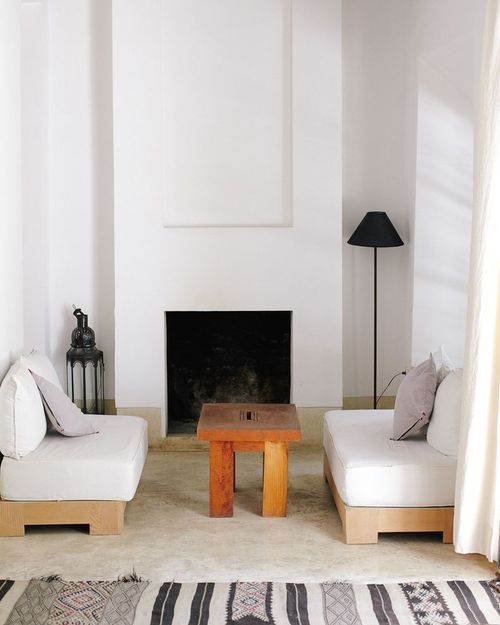

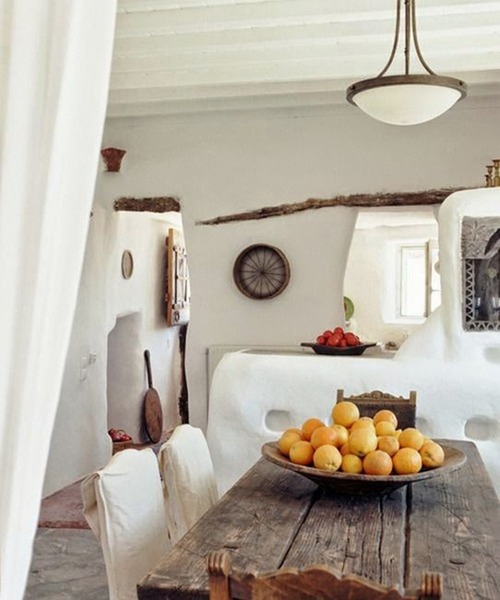


Whitewash? Moroccan riads? Certain kinds of statement chairs? Concrete floors? It simultaneously filled my heart and made me feel the teeniest bit sad. Sad in that way when someone else nails so many things you love and it makes you realize, "Oh right, I'm SUPER ORIGINAL."
It also kind of reminded me of this hilarious bit about having too many gummy bears.
(What is I Love Lamp? This is I Love Lamp.)
When we moved up here 10 months ago, I made a list of things I wanted to fix in the house within the first year. And I wrote it down because it's really, REALLY easy to just get used to things. "We'll fix that soon" becomes "we've been living with that for five years" very easily for even the most design obsessive folks. One of the things on the list was the doorway between the kitchen and the living room.
Back in February we painted the kitchen, made small bar, and hung our barn door to create a separation. But we called it a day before finishing the saddle and frame. Mostly because we weren't quite sure what to do.
But after 10 months of taking an awkwardly large step over this gaping hole, it was TIME.
The old beam is kinda cool, but the bulbous insulation and inevitable dust bunny collections were not. And while the stratigraphy of the frame fascinates every contractor/carpenter who comes through, we were pretty sick of looking at it.
So what to do?
The previous owners left a big stack a cedar barn siding which we've turned into everything from the Inn's bar to the tables to my desk. Not to mention a TV stand, a nightstand, a day bed.... haha! So naturally, we decided that cedar would do just fine as a frame and saddle.
Steven measured, cut the pieces, and drilled some guide holes for our screws so as to not split the wood.
And no, it's not exactly traditional to use screws for this kind of thing, but we've got a rustic enough look going on and down the line we might want to remove the wood and use it elsewhere when we do a deeper kitchen renovation.
We started with the top part of the frame.
Moved to the side pieces, several of which we had to notch to fit the irregular shapes going on.
And then fitted the saddle, which involved some "poor man's planing" as Steven called it. Yes, that's his Swiss Army knife.
He added supports since we didn't want the saddle to bend when you stepped on it. They look like they were installed by a 3 year old with a hammer but the erratic placement is actually quite precise to fit the uneven surface.
And voila!
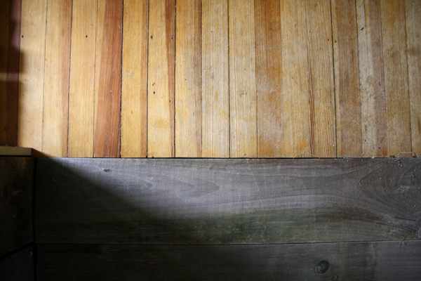
Steven also decided to add a small bit of trim to the part in the kitchen where the wall otherwise very unevenly meets the frame to finish it off.
Tada!
I love it, love it, love it. Though it's really kind of bizarre how luxurious having a continuous floor feels. Naturally we keep stepping over it as if the saddle still isn't there. I'm sure we'll happily get used to it soon!
(What is I Love Lamp? This is I Love Lamp.)
As the exterior of the house is being painted (photos coming soon!), I've been a busy bee (between check-ins and bar tending and laundry and and and...!) brightening things up inside the house. I started with Steven's studio because he got jealous of mine after I'd gotten jealous of the hotel rooms. As you can see, while his room was spacious and full of windows, it was dark and often felt cluttered despite lots of tidying and reorganizing:
It certainly didn't help that his mountain view became a dumpster view for the past three and half months. And while we never took that shot from the inside, you can see here what it looked like from the outside. His windows are the bottom four:
Not pretty.
I painted his built in shelves a blue-ish grey back in January, which helped a bit:
Oh man was THAT a labor of love. So much taping! And awkward climbing and bending! It actually made painting the rest of the room seem quite simple by comparison which for whatever insane reason I decided to undertake the Monday of Labor Day after all of our long weekend guests checked out. Because, you know, that wasn't a busy weekend or anything like that...?!
All the while Steven made some more cedar contraptions which I'm looking forward to showing off next week in my "after" post!
(What is I Love Lamp? This is I Love Lamp.)
I forget how I came across her work initially, but are these fabulous spaces oh so fabulously captured by photographer Brie Williams or what?


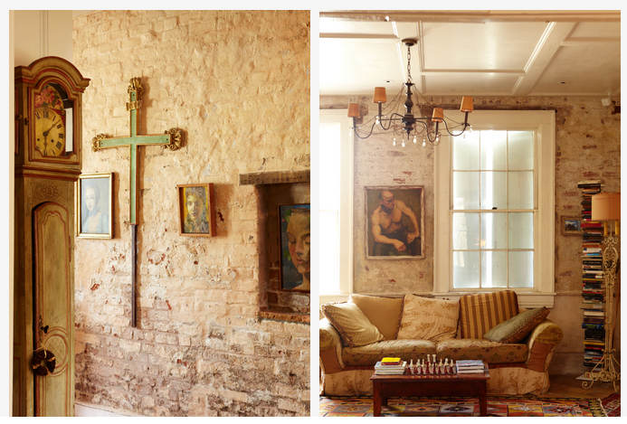

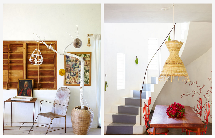 Cozy, clean, bright yet soft...
(What is I Love Lamp? This is I Love Lamp.)
After three weeks of we-just-opened madness I finally had a moment to sneak back into my home office and assess the damage I had inflicted during the chaos of launching. Unsurprisingly, it wasn't pretty:
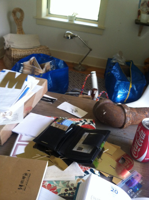
I mean yeah-- that's a rusty pipe sitting on my desk. Shit had gotten a little CRAZY.
On a certain level I think I was letting the room go to hell because I knew it needed a big reorganizing anyway. And in an effort live a somewhat balanced life, I was also doing my damndest to not let the business physically spill over everywhere in the house. So anything hotel-related that wound up in say, the living room, I started chucking into my office. Like literally throwing then shutting the door.
When we moved in, my home office was the first room I painted. It used to be a dark green which emphasized the low ceiling and made me feel claustrophobic.
When I was done it felt brighter and like it belonged to me so even though it was a bit sparse, I was mostly pleased.
Then I got jealous of the hotel rooms.
And by that I mean, I really wanted one of the beautiful cedar tables that Steven made for our Deluxe Kitchenette rooms for myself.
So he made me one! Which I then carelessly covered in crap as mentioned before. Shame on me.
Til this week that is, when on my very first official day off (hooray for hiring an Assistant Inn Keeper!) I did one of my favorite frivolous things in the world: organized stuff and rearranged furniture. Or as Steven calls it: playing dollhouse with the real house. Ta dah!
I'm in love! I finally like my home office as much as I like the hotel rooms and bar. And I think it was designing those other spaces that helped me solidify what I wanted out of this space: clean lines, good functionality, wild flowers on wild flowers, light.
I hung the NY Times article that Spruceton Inn was featured in behind me. (My parents had it framed and sent to me, how sweet is that??) It serves as a reminder that this whole thing went from being some hairbrained idea of mine to a reality that was covered in the likes of my favorite newspaper before we even opened. It makes me want to keep aiming higher!
I've also got my some of favorite books near at hand--
And an array of useless and useful things that crack me up like a toast rack full of stamps, a swan full of duplicate hotel keys, and a jar full of sentimental objects like my Moroccan host mom's couscous recipe and part of the cork from champagne we popped on opening day.
I'm so pleased, it makes me want to rearrange the rest of the house! Maybe on my next day off...
(What is I Love Lamp? This is I Love Lamp.)
Ever heard of the Brooklyn based textile company Aelfie? No? Well I've just done you a big favor. Or your wallet a disservice, depending how you look at it. She sells both vintage and original pieces. Here are a few of her vintage rugs:
And some of her original ones:
I'll take one of each please!
And if you don't much value your own productivity, go ahead and check out her Tumblr of what inspires her.
Ugh, that bathroom! Never before have I needed so many clashing tiles in my life all at once so badly! Also, I remember that skateboard show at the Brooklyn Museum. It was a Mounir Fatmi installation about the clashing of cultures and globalization. Super simple, super cool. Man, thinking about that almost makes me miss NYC...
(What is I Love Lamp? This is I Love Lamp.)
While they're a rather expensive accessory I'd say babies look damn cute the bar, wouldn't you?

(What is I Love Lamp? This is I Love Lamp.)
It's ready. Now we just need the people permits then the people.
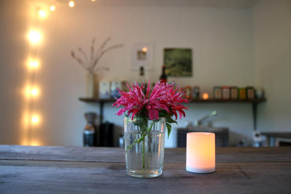



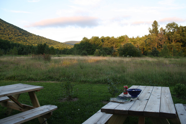 (What is I Love Lamp? This is I Love Lamp.)
Ever noticed that I've never once shown you a picture of the outside of our house? That's because it's been unfinished!

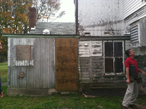


After finishing the work on the motel (gotta do your money maker first!) we hit the house. HARD. And we're still going. I can hear the carpenters whistling to themselves outside my window right now. But we've made some real progress in the past few weeks and it's enough that I'm finally ok with showing ya'll what it's looked like since we moved in.
Actually, we heard from neighbors that it's been un-sided like this for 6 years. Which makes the relatively low level of water damage and rot we've dealt with A MIRACLE.
But anyway! The first step was to figure out which of the extensions were salvageable.
We had like 20 different plans-- keep the upstairs bathroom, ditch it but keep part of downstairs, reframe the whole thing, get rid of it all. Ultimately it came down to the placement of a big ole' waste pipe that would be crazy to try to move, but we didn't even know that until we started taking stuff down.
This project, way more so than the motel, has been a real decision monster. As in, there have been A THOUSAND decisions to make and remake and unmake because the circumstances keep changing. And with the hotel I'd spent so much time and energy planning everything, analyzing the guest experience and how that should influence the design, that by the time we got the house I was kinda like, "Hell, I don't know what I want over here. What do you think Mr. Plumber Man?"
In the end we decided to remove the ancient and rotting 2nd floor bathroom extension that had been added some time in the '60s. It's amazing how quickly some demo can happen. We bathed Waldo in the tub in the morning and after lunch it was gone!
Along with all the other rotted siding as you can see. At this point we had a pretty good laugh at the idea, "And we thought it couldn't look any crazier outside!"
Then we removed a totally rotting, leaking, uninsulated shed-like extension right off the kitchen. There were so many ancient outlets, electrical wires, gas lines, and pipes running along the outside of it, all generally giving Building Code the finger-- it was a real dance to coordinate between all the carpenters, plumbers, and electricians working on the project. Not all of which went well. I had people cursing each other out each telling me the other was incompetent, unethical and all other sorts of stupid things. It was infuriating and uncomfortable but I stood by everyone I hired, asked grown men to act like grown men, and it got done.
On top of it all it rained constantly throughout this whole process meaning a) the guys could hardly get full days of work in so we kept falling further and further behind schedule and b) the whole place had to be tarp'ed like crazy to protect from water damage and it sounded like we lived in a goddamn sailboat with all the flapping and whipping about.
Side note: once the extension came down we were left with a concrete patio. We took this picture that first evening with it after talking about how much living in Mali had prepared us to live with this bizarre mix of no privacy, lots of noise, and developing world conditions. Not to mention the condescending attitudes from men (both accidental and purposeful) towards me The Young Woman which I've experienced working in conservative Muslim places like parts of Mali and Morocco, for which I have zero tolerance in America.

The patio itself also reminded us of this great restaurant/bar in Bamako named--rather inappropriately--Beirut because of its bombed out look. The previous tenants apparently trashed the place after not getting their lease renewed, and the new tenants decided to go for a rough/refined juxtaposition look.
But anyway!
Plywood went up next and we knew we'd been living in a construction zone too long because when we saw this we thought, "Ooh I love it! I wish we could keep it just like this!" Not even kidding.
And by the way, all the while, windows are being replaced and dust and bugs and small animals are all making themselves right at home in our insane kitchen.
The next steps in the back required capping of pipes, reframing over our basement access, repairing soffits, new flashing and trim, all new wrap, plus a thousand other small repairs I can't even sort through right now.
And finally-- FINALLY!--this week the siding has begun to go up. In many ways it's the most straightforward and superficial of the changes, but it's also the most satisfying to see.
We can't help but keep exclaiming, "It looks like a REAL HOUSE!" Neighbors are slowing down as they drive by, even the postman and FedEx guy have told us how good it looks. It's all very encouraging!
After all the siding is done, we'll redo the roof then paint the whole shebang. We're going all white, windows and trim included, to return it to its old farmhouse look. Even all of our trim and cornerboards and such were designed with its former self in mind.
And then...? It's hard to even imagine this property not under construction of some sort. And while I'd love to just enjoy some peace and quiet out here I hope that by the time we finish--if not before--the State will have given us our final permits and the place will be crawling with guests!
Here's to hoping!
(What is I Love Lamp? This is I Love Lamp.)
Since it's a nice crossroads of our look and a good price, we've been hand painting all of our signage out here at the inn. We're going about it in a pretty old fashioned way too: Step 1. Print an outlined and life-sized version of the wording.
Step 2. Flip it over and trace the back with charcoal.
Step 3. Place the paper charcoal side down on the sign and rub so that a faint outline remains on the sign, then paint over it!
Step 4. Wipe down any remaining charcoal once and paint dries and voila!
We used the same method yesterday for painting the room numbers.
The door handles and lights are on alternating sides, so I knew I wanted the numbers to be in the middle to give the building a uniform look.
I thought about painting big numbers right in the middle of the doors but decided that might awkwardly take over. So I decided to paint them centered on the door frame instead. Actual numbers (like 1, 2, 3, 4) would look weeny on that 4" trim and be hard for guests arriving at night to see, so I decided to use the font I made for our logo and spell out the numbers instead.
And I love it!
There was one hitch: we have a mechanicals/laundry room in the middle of the strip. "Laundry" wouldn't be hard to paint but it sure would be boring. So we went with this instead:
Cracks me up!
I know this means that everyone and their mother are going to open that door. I can't decide if it's funniest to just leave it as an immensely boring laundry room or to take it further-- label the washing machine "time machine", the dryer "teleportation device"... You'll have to come for a visit and see for yourself!
(What is I Love Lamp? This is I Love Lamp.)
Today my fan-girl dreams came true: Design*Sponge is featuring the Spruceton Inn!
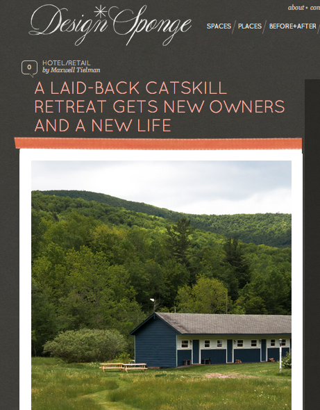
!!!!!!!!!!! [That's my computer version of pure excitement.]
A few weeks ago, Maxwell Tielman came by to shoot the place and I've been looking forward to seeing how he captured it ever since. Needless to say I'm pleased as all heck!
A week or so after that, he wrote to say that they'd like to expand upon the piece and include an interview about the process of renovating etc which I was more than happy to oblige. Lemme say, it was REALLY hard to not write a novella in response-- it's been quite the journey so far.
You can check the whole thing here. And if you aren't an avid reader of Design*Sponge yet, you should be! Like I've said before, I think they do a really wonderful job of being MUCH more than a website of pretty photos.
Thank you Max and everyone at Design*Sponge for the coverage!