The Force Is With This Guy
I love me a good re-working of a classic movie poster or book cover. How great are these Star Wars posters from Ryan McArthur?


(Photo's via MacArthur's Etsy shop listed above.)
I love me a good re-working of a classic movie poster or book cover. How great are these Star Wars posters from Ryan McArthur?


(Photo's via MacArthur's Etsy shop listed above.)
My boyfriend Steven Weinberg just started a new series with Brooklyn Based called Five Questions, One Drawing. His first interview is with super cool local author Emma Straub.
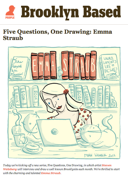
Check it out here. And tune back to Brooklyn Based next month to see who's next!
Guys, I know I'm a whole lotta late on this one by OH MY GOD, the Fuck Your Noguchi Coffee Table Tumblr is GENIUS.

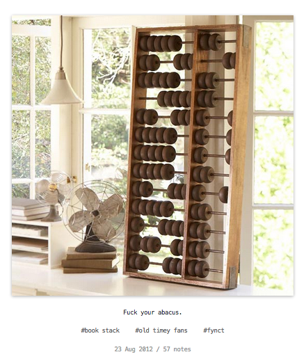

Sometimes when I go deep into the design blog worm hole, I eventually resurface feeling EXACTLY like this.
(What is I Love Lamp? This is I Love Lamp.)
(Photos via the Tumblr)
I like these baby photos that Adele Enerson takes of her kid. They crack me up.


And as long as we're on the baby train, how great are these photos of Barack Obama messing around with kids?


And no, I'm not angling for a baby of my own right now. But I would TOTALLY watch Babies again. Right now.
99% of the time I am not a fan of crap hanging on a fridge door. Here is the other 1%:

If you're gonna go for it, GO FOR IT like these guys did.
(What is I Love Lamp? This is I Love Lamp.)
On Monday, my boyfriend and often collaborator Steven Weinberg took over room 303 at Nu Hotel (where I work as a concierge) to paint a mural!
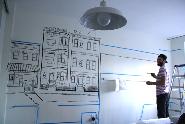
The result is something totally adorable, hip, and funny that pays tribute to the hotel's Brooklyn location. (I know, I'm pretty much his #1 fan.) Check out the time-lapse video of its creation:
Here's the whole shebang:
Once he had the paint brush in hand he had to keep going, so not only is there this full street scene (including little gems like dinosaur bones buried beneath the G train tracks), but other bits around the rest of the room like this building over the toilet that you can see in the mirror as you sit and the throne and uh, do your thang:
So if you ever come to Brooklyn for a visit, stay at NU Hotel and request room 303! Steven's art will treat you good and I will concierge the shit out of your stay.
And take a poke around Steven's website to see what other kind of mural madness and art show fun he's been up to lately.
I was poking around Hotel Chatter the other day (because a promotional poster I designed for NU Hotel's new Sleep It Off package made the site) and I came across this great bit comparing the libraries of two new, very cool hotels here in New York: NoMad and The Wythe. NoMad is a luxurious slice of hotel life on 28th St. and Broadway. When it first opened last year I read something about the rooms being designed to feel like a mix of the New York and Parisian apartment you wished you always had. YES.
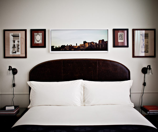

 Needless to say, their Library--which is also part of their bar-- is splendid.
I went and had drinks there this summer with my Mom. We sat on the couch on the bottom left of the photo and drank classy cocktails with egg whites in them and whatnot. It was DEFINITELY not this dark, which I must say, would be very not reading friendly.
There are 3,500 books in The Library, all hand picked by Thatcher Wine who owns Juniper Books in Boulder. He says he picked them all while "working closely with the developers, designers, and restaurant operators". All the titles on the lower level were "chosen by subject and is organized that way - entire sections of books about France, New York, music, wine and food, etc."
I must admit I remember the cocktails better than the book selections, if only because the vibe was unfortunately very "do not touch".
On the other end of the spectrum is the library at The Wythe, that hotel in an former textile factory in Williamsburg that I'm jonesin to have a staycation at. Let's take a gander at their gorgeous rooms again, shall we?
Their library is decidedly less formal than that of NoMad, chock full of Idiot's Guide To's, Hardy Boys, Snookie biographies, and board games:

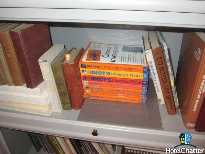 Kudos for the hip/kitch selections that very much reflect the playful air of Williambsurg but DEAR GOD what is happening with the display strategy here? For a hotel that otherwise looks like it was styled down to the seams, this just looks... kind of slap dash.
Before I go, here's one last hotel library thought: did you know there is a place in Midtown called The Library Hotel that is inspired by the Dewey Decimal System? According to their website:
Each of the 10 guestroom floors honor one of the 10 categories of the Dewey Decimal System and each of the 60 rooms are uniquely adorned with a collection of books and art exploring a distinctive topic within the category it belongs to.
I was all revved up to learn about the Dewey Decimal categories and the book selections in each room, but I just cannot for the life of me find out any actual book information on the website. It's all about free Wi-Fi and continental breakfast. Ah well. Someone will just have to stay there and tell me about it.
(All photos via each hotel's website, excluding the Wythe Hotel library ones which are from Hotel Chatter.)
(What is I Love Lamp? This is I Love Lamp.)
One of the more exciting moments in making a book is finally seeing THE COVER. And while Steven and I were very much involved in the process for To Timbuktu, we are only two contributors of many for this next one and so this was a big fat surprise:

SURPRISE! Gotta love pancakes. Which means kids, you've gotta love essays!
The books comes out June 2013 which sounds like a million light years away (yeah that's right, space jokes) but I'm sure it'll sneak up on all of us soon enough.
Last night Steven and I had some friends over to watch the VP debate so we could all enjoy some "facts" and wine together. Since I love an excuse to decorate anything, I had my eyes out for red and blue crepe paper all week but alas, I couldn't find any in time. I DID however find some red and blue candles at our bodega that I then oh-so-classily adorned with a multitude of American flag stickers.
Much to my great happiness, one of our guests showed up with red and blue flowers that were literally oozing with their patriotic colors.
And don't worry-- I saved enough stickers so that we could all wear one on our lapels BECAUSE WE LOVE AMERICA and all this election #malarkey #stuff.
(What is I Love Lamp? This is I Love Lamp.)
I'm not a church going gal, but if I were, and if I lived in the village of Chodovice in Eastern Bohemia I would DEFINITELY get my godly time on at this church designed by Jakub Berdych and Maxim Velcovsky:

Holy Verner Pantone chair! I ADORE this combination of old and new as well as the use of carpets that are much more frequently found in mosques. In the words of the designers themselves:
The central nave has been stripped of dull repaints and left totally exposed so that visitors can watch the course of history on fragments and details on the wall...This space is an eclectic cocktail and a place to ponder, moving us towards cultural dialogue.
I also find it kind of hilarious that the designers note--
although they had known that as a result of this work they would lose the warranty of several years provided by the legendary manufacturer of the Vitra furniture [by carving out the crosses in the chairs], they were not afraid to experiment.
Throw the warranty to the wind, I think it's an experiment that's been pulled off superbly well.
(What is I Love Lamp? This is I Love Lamp.)
Thank you Germany for the world's largest floating bookstore:


And it isn't just a store. Part of the Logos Hope's mission is bring low cost books to parts of the world where they aren't available and help build libraries on shore. It's also worth noting that the entire crew is unpaid for their one to two year stints at sea. Meowza!
Check out the ship's schedule for the next six months here. It makes me wonder how many language sections they must have...
(And thank you Book Riot for the tip!)
The other day Steven and I sat at the marble bar at Provini, a small Italian joint in our neighborhood. So dang elegant. The bar that is. Although I'm sure we looked dang elegant as well... (What is I Love Lamp? This is I Love Lamp.)
I'm pretty in love my with New York Magazine subscription. I mean, who doesn't adore their high brow/low brow Approval Matrix? And while I'm feeling a little sick to freakin' death of Brooklyn being slapped on everything, I was nonetheless intrigued by Mark Jacobson's front cover piece:
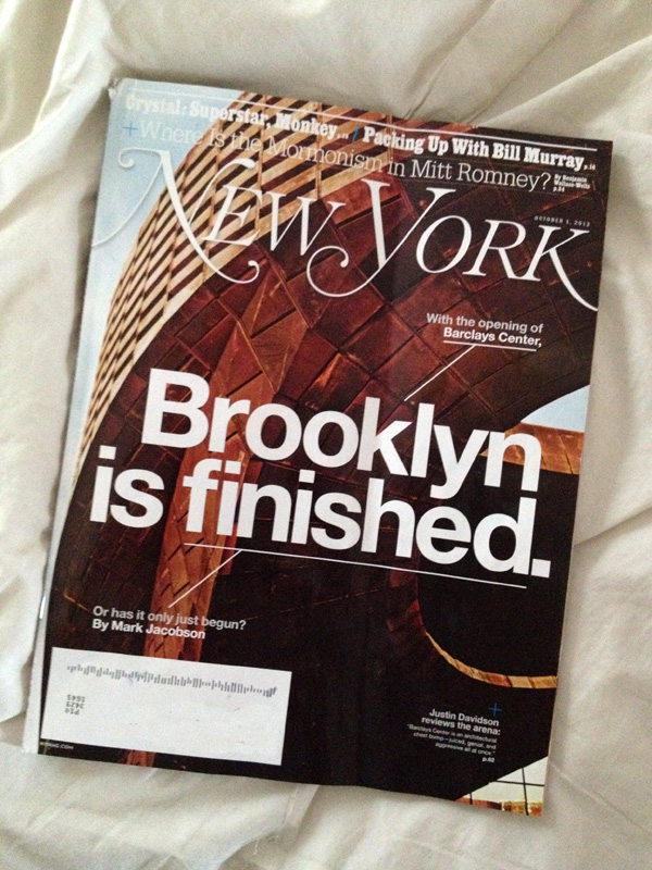
In a way it feels like five articles in one with Jacobson waxing poetic about everything from borough president Marty Markowitz being easy to impersonate to his own grandmother's love of sweets, but stick with him. It's definitely a worthwhile read about this ever changing borough.
One of my favorite parts of the whole article is when his (white) daughter, who has recently moved to "historically black" Bed Stuy (after a childhood spent in predominantly white Park Slope) tells him it's a place where "people like me live these days."
"But what kind of person was that?" he asks.
"You know. A hipster. A Brooklyn hipster," she replied with the firm matter-of-factness of someone who had at long last accepted a self-evident truth. "I wear tight jeans. I like indie bands. I enjoy locally sourced produce. I have a degree that may turn out to be useless. I live in Brooklyn. What else am I supposed to call myself?"
It was a stunning admission, this utterance of the H-word... I'd rarely heard anyone voluntarily describe themselves as such, certainly not my own daughter.
He goes on to hang out with one of his old school buddies, Adam, who's been working on the Coney Island boardwalk long before it became retro-hip. Adam goes off about how terrible the place is now because of "Hipsters, fucking hipsters!".
Didn't like to disagree with Adam, whom I love. But these were my kids we were talking about, them and their friends. They weren't the ones building high-rises in Williamsburg, the big arenas. They were just looking for a place to be young. Who knew why perfectly normal-seeming people get tattoos, drink so weirdly much, make fetishes out of various food groups like cupcakes, and adopt the diffident poses of actors in Wes Anderson movies? Youth occurs in a time of its own, immune to criticism from those claiming to have had better youths. As idiotic and privileged as it might seem on the surface, growing up remains no easy thing. Every passage to adulthood is a hero's journey, to be respected, in its own way.
The bold emphasis is mine. I love that he spends a big chunk of the article basically telling nostalgics to shove it. Not because I (and he) don't respect the history of neighborhoods. Quite the opposite! But more because it's important to remember that everyone always thinks the world is ending, everyone always thinks they're the first to have ever been young, and everyone always has their panties in a twist about something.
This week I'm wishing my bathroom didn't have this weird textured stucco thing going on so I could wall paper it like these bold powder rooms from Lonney Mag.


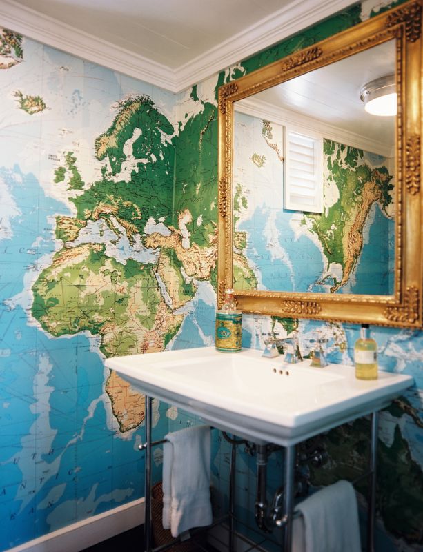
Ok, actually EVERY week I'm wishing my bathroom didn't have that weird stucco thing going on, but let's not get all whiney about it...
(What is I Love Lamp? This is I Love Lamp.)
My alma mater, Pitzer College, has had the most Fulbright grant recipients (per capita) of any college in the U.S. for eight years in a row now. When I graduated in 2006 and was awarded a Fulbright to conduct my research in Mali (which then lead to the writing of To Timbuktu), I was one of 14 students out of a class of barely 300 to receive one.

Part of that is because of the global vision and unique talents of the students who apply for these fellowships--of course-- but it's also because Pitzer's faculty and staff do an amazing job of encouraging students to go after the grants and preparing them for the application process.
So I would like to pass on a few bits of advice I learned at Pitzer about the Fulbright application process since this year's application deadlines are right around the corner. Keep in mind, I'm talking about the research grant. There are other types of grants-- to teach, to study-- and to learn more about those, check out the Fulbright website.
So cruise the Fulbright website for more info, and feel free to hit me up with more questions if you've got 'em. The Fulbright is an absolutely amazing program that I think over all is really achieving its goal of cross cultural understanding and friendship.
Have you been to Owl Farm yet? You should go! 22 beers on tap, hilarious and knowledgable bar tenders, AND signage by yours truly. I showed you how Steven and I did the lettering work inside the bar, but we hadn't gotten to the outdoor sign yet. Now we have! Check it out:
Steven and I worked on the lettering design together, then he took the reigns and painted it on a big slab of wood in the bar's kind of scaaary basement.
Yes, his "work table" was a selection of kegs. Gotta love beer.
Steven is also going to add some owl inspired mural work above the bar some time in the next two weeks. So come by and check it out! We can often be found there enjoying a football game and hoppy brew...
My favorite part of Seventeen magazine was always the quizes. What's Your Love Style? What Kind of Friend Are You? Hell, I'll admit it-- I even made up my own quizes for myself just for fun. (I know.)
So of course I was THRILLED to find a link on Apartment Therapy to HomeGood's Stylescope quiz!
Click the link above, mark the 5 photos that "speak to you" and voila! You are now a design type.
I am...
I like that the quiz gives you a little assessment of what the label means and then gives you some design tips that relate to you. For example, I have been directed to use my "exotic textiles" in my decor, perhaps as a funky ottoman cover. DONE.
I know, it's kind of ridiculous and cramming us all in little boxes that don't actually illustrate our individuality... but it's so satisfying! I love it.
(What is I Love Lamp? This is I Love Lamp.)
I absolutely love these shots from Laurent Chehere's series Flying Houses. (Thank you Honestly WTF for the tip!)


I just came across this link to a dollhouse made out of bookshelves and thought, Cool design idea.
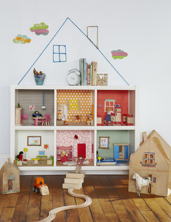
Then I thought, I should look up some more dollhouse stuff online.
And then it was suddenly ten hours later.
My earliest design experiences were all with dollhouses. My first dollhouse was a Sylvanian Family home in which a bear and bunny family cohabitated.
Yes, all in a one bedroom house. But hey, they were originally from the woods--what did they care? This was DEFINITELY an upgrade for them.
My parents love to remind me that they often caught me playing with them, earnestly singing the 80s commercial theme song: Sylvanian Families.. Each sold separately!
When I was about eight I got a “real” dollhouse—“real” in that the place was populated with a human family and had a much more realistic bathroom and bedroom count for the inhabitants. My mom and all her design skills persuaded me to go for a Victorian style house, complete with fancy folks to populate it to whom I gave snooty English names like Victoria, Charles, Henry and Elizabeth. I spent lots of time rearranging the furniture and collecting decorative pieces like fireplace fans and faux-marble busts—essentially being my Mom.
We painted it lilac--to match my room of course--and it looked a little like this:
Without the 30% OFF sticker hovering in the air of course.
Cruising the internet for that picture I came across this super cool lazer cut Victorian dollhouse kit:
Part of me was a tad tempted to consider getting it, until I saw the photo of what it looks like pre-assembly:
Mother of god! This might be THE least encouraging DIY kit photo I've ever seen.
But back to this dollhouse-and-design train of thought: Want to make an Ikea design nerd real happy and maybe a little creeped out? Get him/her this adorable miniature set:
And by "him/her" I just might mean "me for Christmas this year".
(What is I Love Lamp? This is I Love Lamp.)